The Pantone color matching system is the standard from which designers and graphic designers work for developing logos and brand guidelines. The color system is universal and allows for all areas to communicate in a color language that is fixed, and not left to interpretation.
Each year, Pantone chooses a “Color of the Year.” The color is decided upon at a secret Pantone meeting held in a European capital each year. The color is reportedly chosen in conjunction with many of the cultural influences that Pantone believes are relevant in our present lives. The color is meant to capture the spirit of the year.
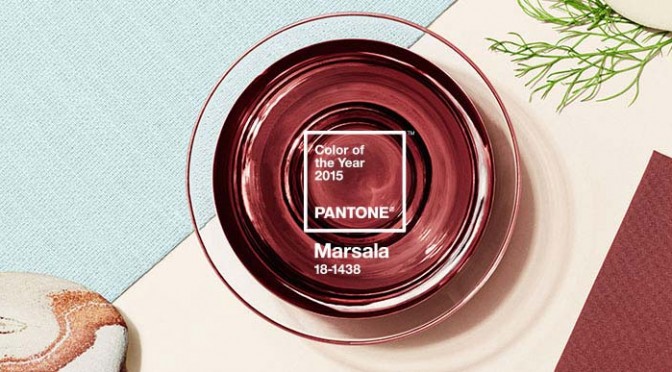
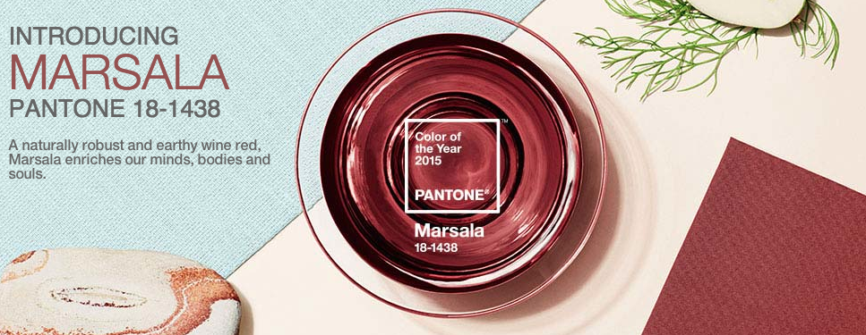
Pantone’s Color of the Year for 2015 is Marsala. It is a mix between red, rust, and burgundy.
Beyonce’ has already sported the breakout color this year. And if Bey has done it, we can expect more stars to follow.
Last year’s color was radiant orchid. Not all that many things are radiant orchid. But, we saw it make big strides in items such as apparel and drinkware. {link to blog}
The challenge we see for Marsala will be finding the right mix between red, dark red and burgundy. And, which products will highlight this subtle hue the best. Will a pen simply appear to be dark red rather than Marsala? Will a matte-finish mug showcase the color better than a promotional glossy-finish mug because of the light glare from gloss? Perhaps branded apparel and imprinted bags will win the day for the unique qualities of Marsala.
To help our designers, idea-makers and customers get into the color of the year we created a Pinterest board.
What promotional items do you think will look best in Marsala?