If you work as a graphic designer or with graphic designers in any capacity, no doubt you are familiar with the Pantone Matching System, which is the standard color matching system across pretty much all industries.
Each year, Pantone chooses a “Color of the Year.” The color is decided upon at a secret Pantone meeting held in a European capital each year. The color is reportedly chosen in conjunction with many of the cultural influences that Pantone believes are relevant in our present lives. The color is meant to capture the spirit of the year.
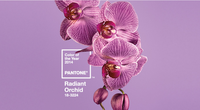
Pantone’s Color of the Year for 2014 is Radiant Orchid.
Last year’s color was green. Lots of things are green. Not all that many things are “radiant orchid.” Our team worked very hard to find promotional or customized marketing products around the office that are orchid. We found these two things that are close.


To help our designers, idea-makers and customers get into the color of the year we created a Pinterest board.
What promotional items do you think will look best in radiant orchid?